About

BioActive is a personal-care brand based in the UAE, developed under Elva Cosmetics Factory. The brand was created to offer a complete hair-care range including shampoo, conditioner, hair mask, and serum specifically crafted to meet the expectations of customers in the region. With a focus on accessibility and everyday use, BioActive aims to stand out in the mass-market segment by combining familiar product formats with a fresh, creative visual identity.

Challenge

BioActive faced several important challenges at the early stage of development.
The client wanted packaging that the UAE market would immediately recognize—bottle shapes and formats commonly used by local competitors—while still differentiating the brand through a new, creative design direction.

Although competing products in the market use similar mold shapes, BioActive wanted to shift away from generic designs and introduce a more modern, appealing visual style appropriate for a mass-market audience. Another requirement was to create a packaging system where three colors would be used, each pair of colors representing a specific variant or “flavor” of the hair-care line.

The timeline was also tight: the brand required full design, printing preparation, and 3D prototypes to be completed within three weeks, making efficiency and accuracy essential throughout the process.

Solution

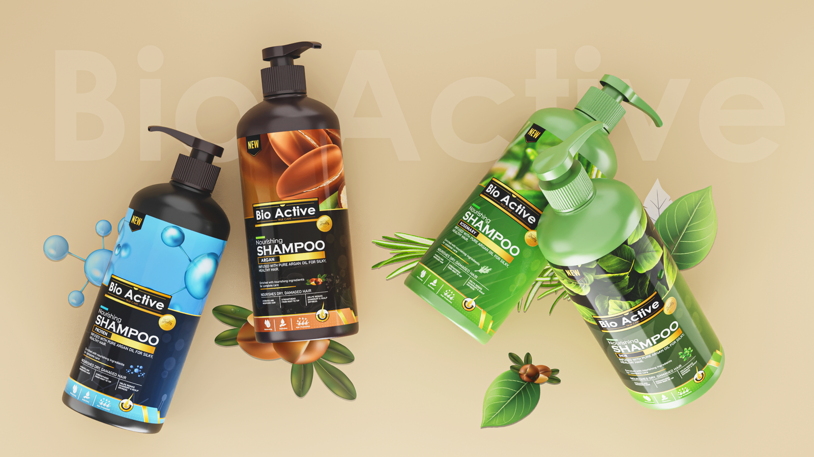
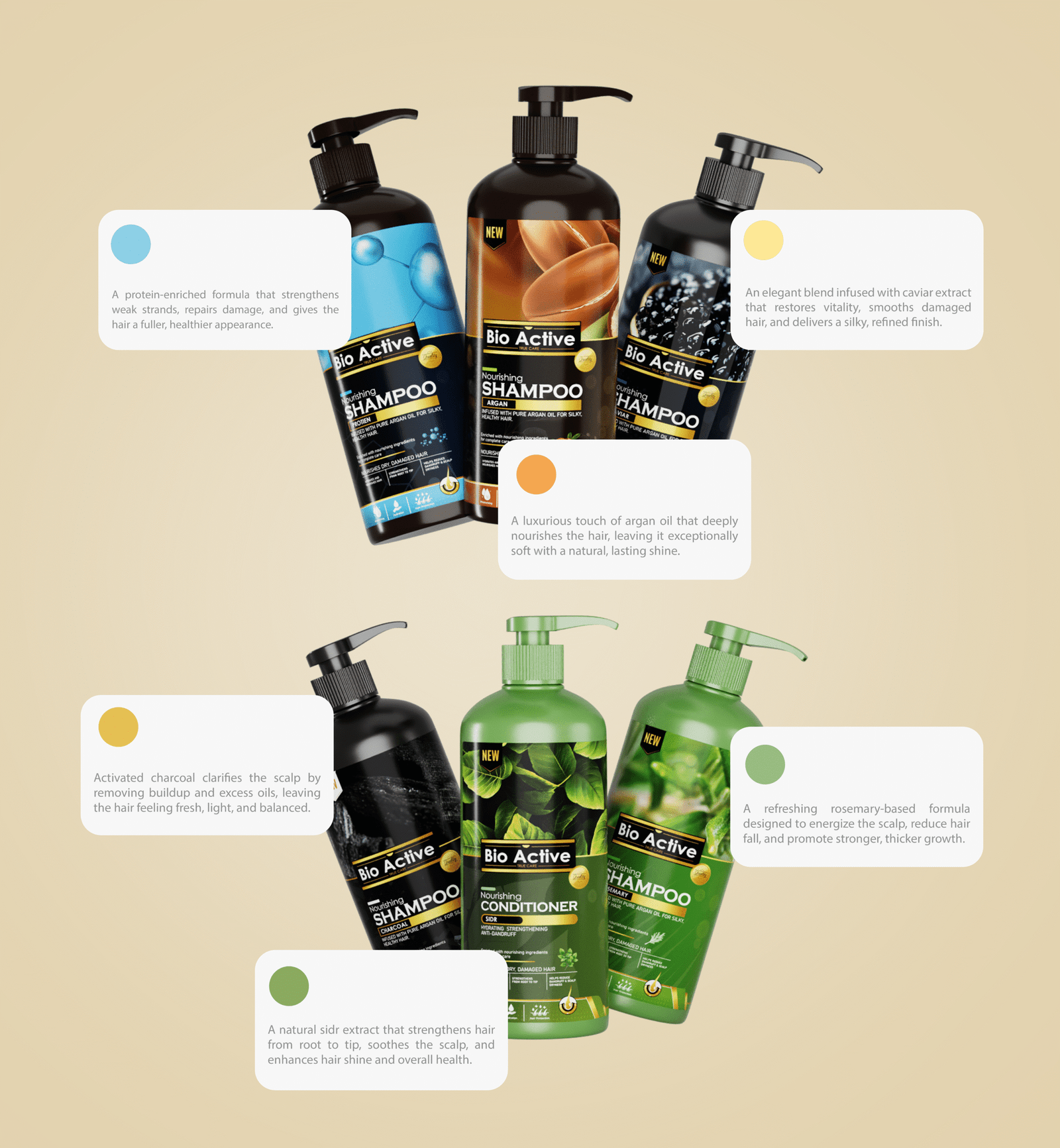
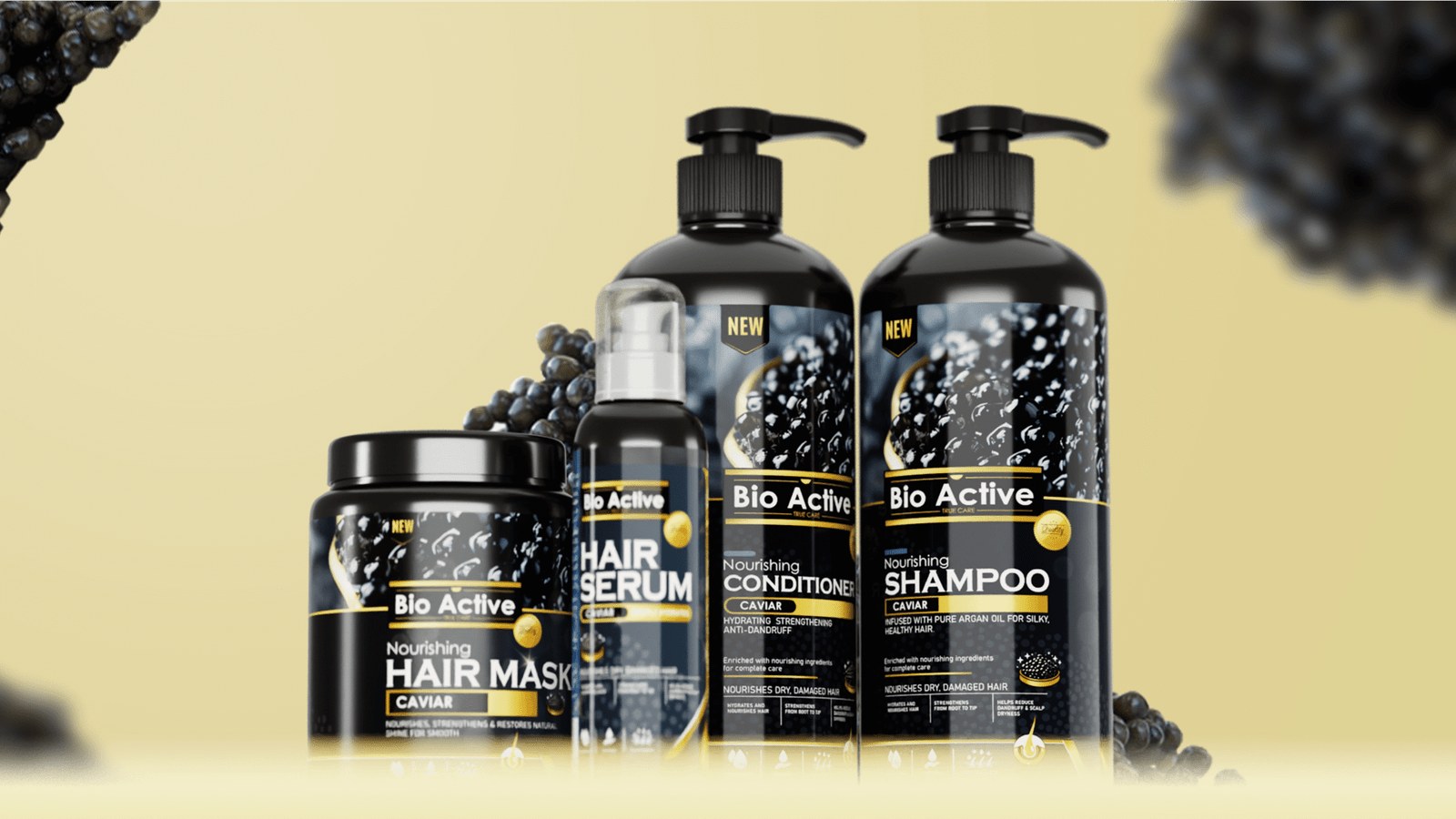
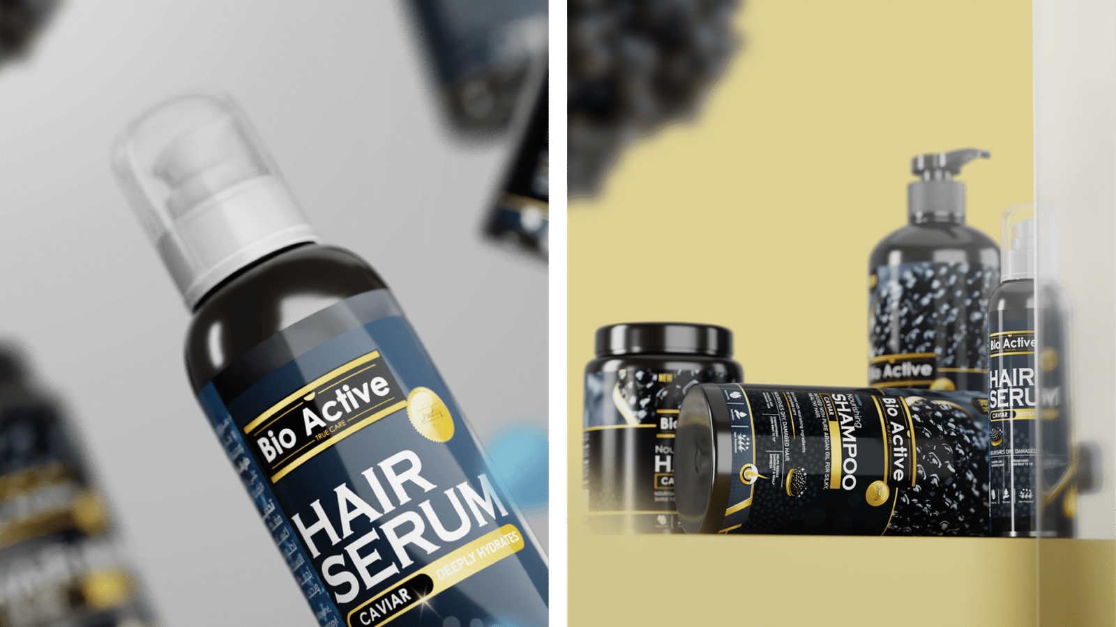
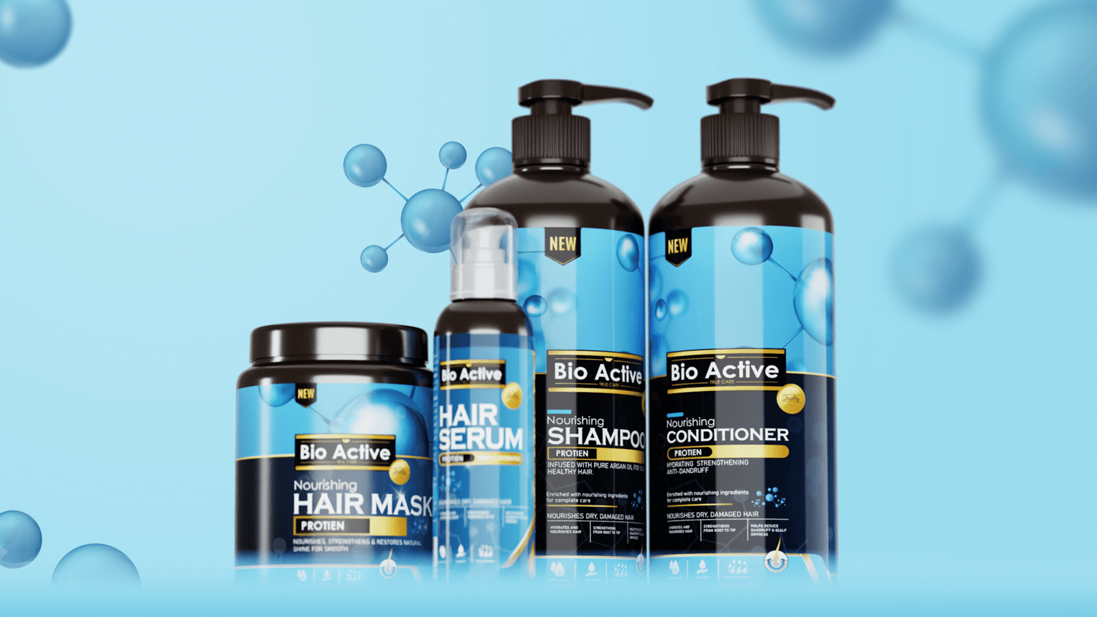
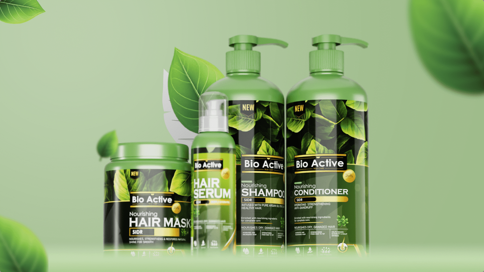
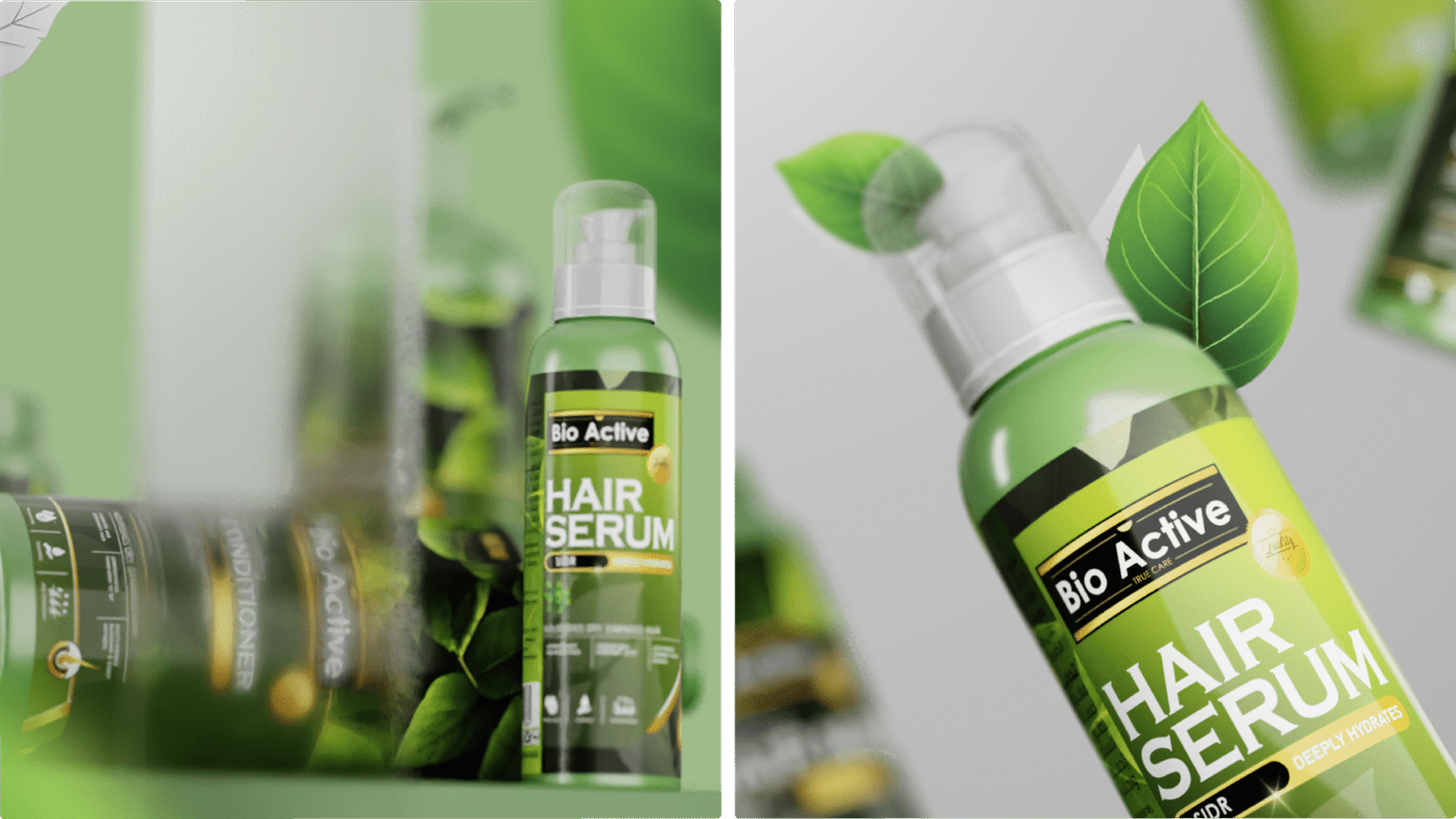
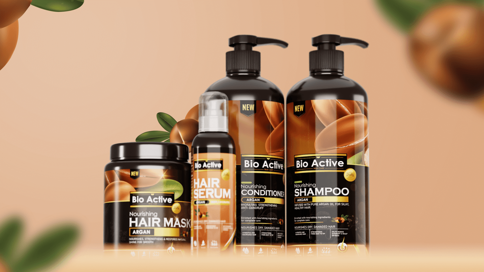
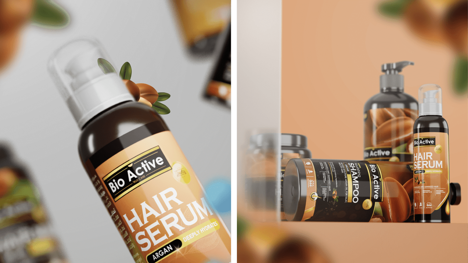
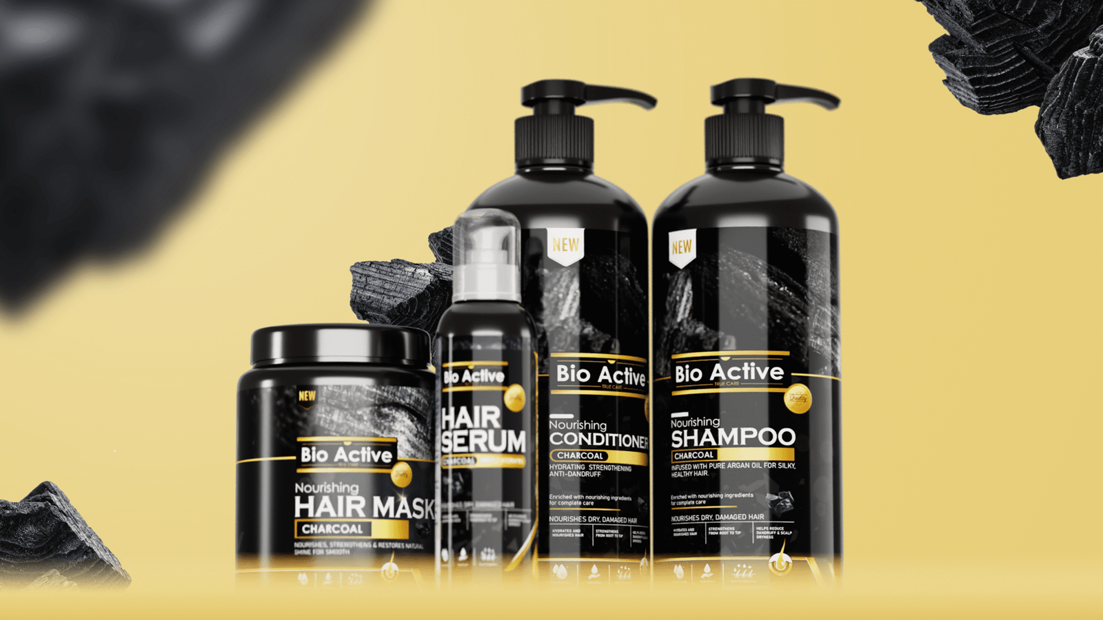
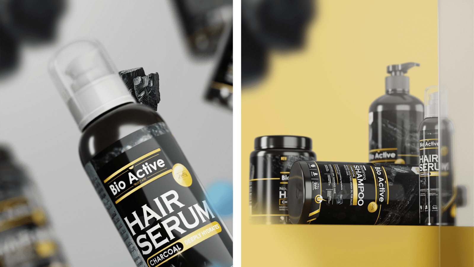
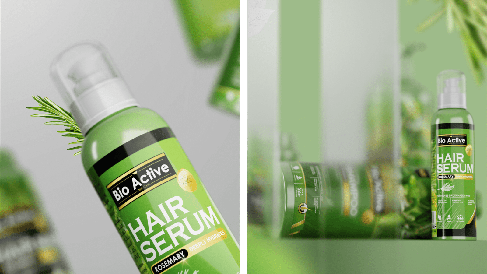
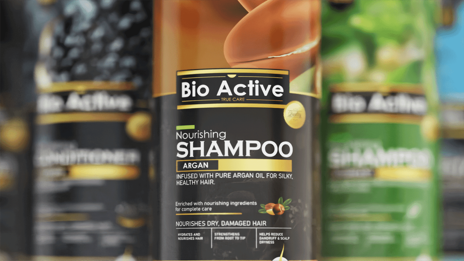
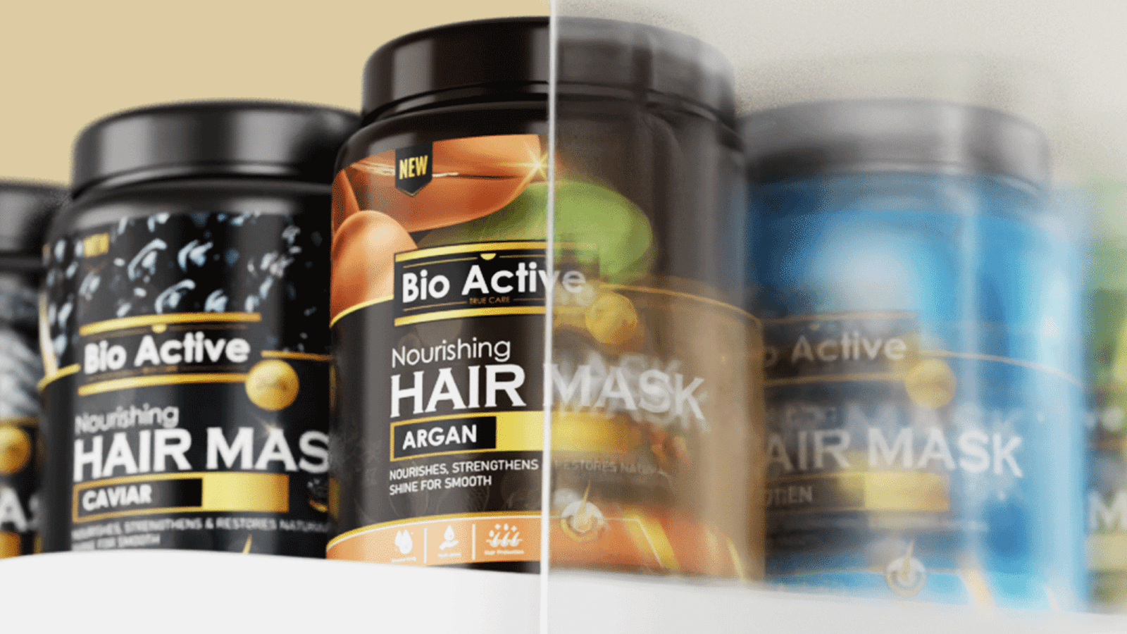
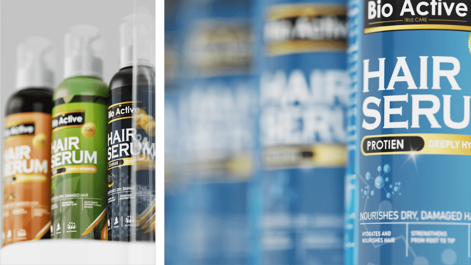
As a freelance designer, I developed a unified and distinctive visual identity system for BioActive that elevates the brand beyond the typical mass-market look while still feeling familiar and accessible to local consumers. I built the packaging architecture around a strong symbolic graphic element, making the products instantly recognizable on shelf.

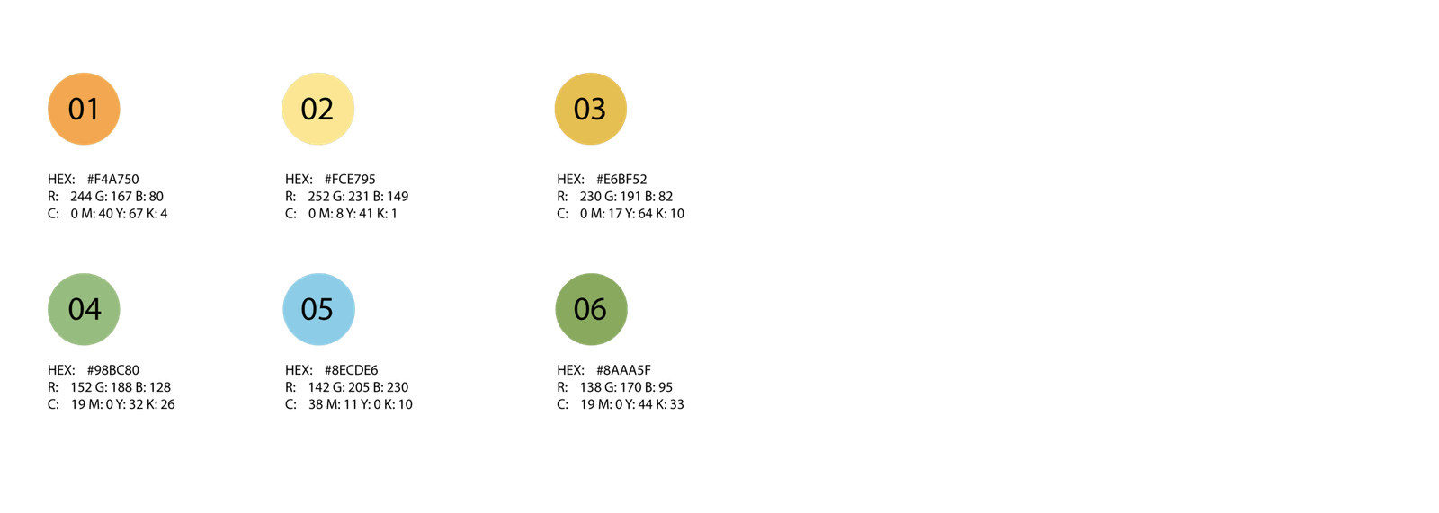
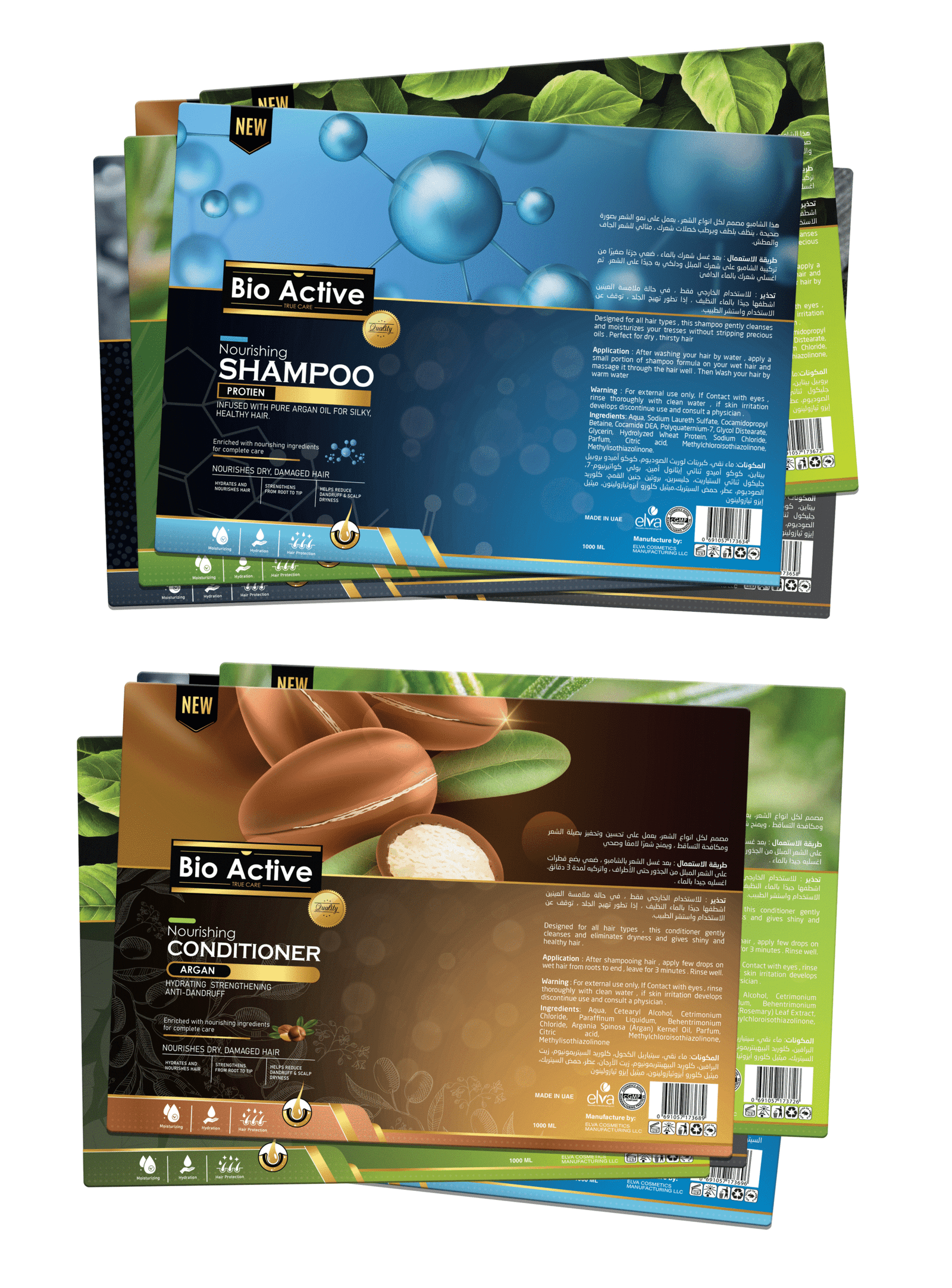
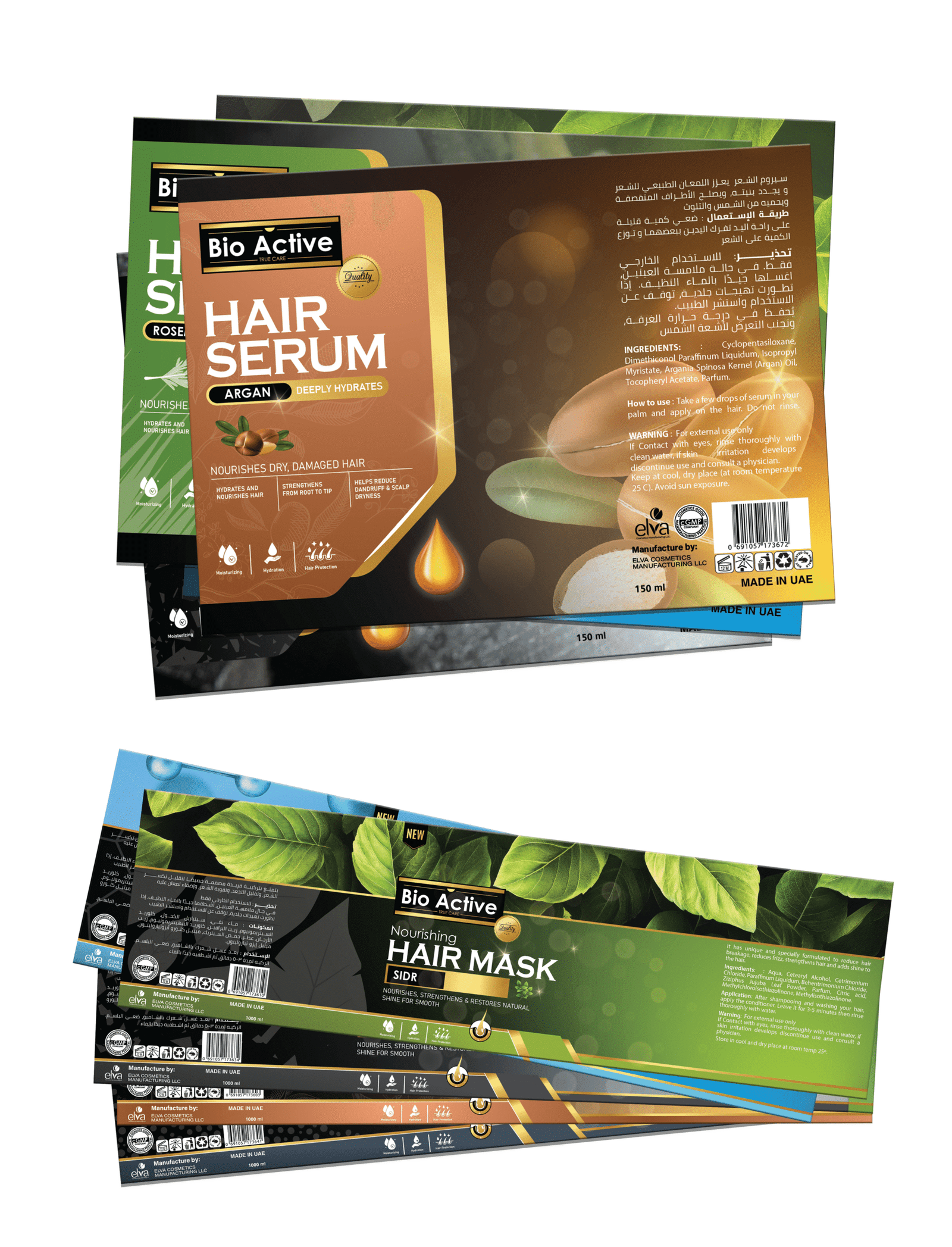
The color system was carefully structured so that each variant uses a dedicated pair of colors, clearly expressing the different “flavors” and helping shoppers quickly locate their preferred formula. Using Illustrator, Photoshop, and Blender, I created the full set of label designs, print-ready files, and realistic 3D prototypes, all delivered within the three-week deadline.

For the final production, the packaging was finished using matte lamination with UV embossing, giving the brand a premium tactile feel while maintaining its mass-market appeal. The result is a cohesive, modern, and market-ready identity that successfully meets the expectations of both the manufacturer and everyday consumers

02 Logotype

Logo Description – Bio Active

The new Bio Active logo reflects the brand’s promise of trusted hair care through a clean, elegant, and contemporary design. The bold white typography conveys clarity and confidence, while the golden lines framing the logo add a sense of premium quality and care. The subtle curved detail above the name introduces a soft touch, symbolizing nourishment and gentle treatment for the hair.

Together, these elements create a balanced identity that feels reliable, refined, and suitable for a mass-market audience seeking true care in their daily hair-care routine.

02 Typography

A bold identity foundation

The Copperplate Gothic family and Bahnschrift family form the core of BioActive’s typographic system.
Copperplate Gothic adds a strong, confident, and timeless character that reflects the brand’s trustworthy and reliable nature, while Bahnschrift brings in a clean, modern, and minimal touch that enhances readability across packaging and digital applications.

Together, these two typefaces create a balanced visual language that feels bold, contemporary, and perfectly aligned with BioActive’s identity in the mass-market haircare segment.

03 Colors

Harmony in every shade

BioActive’s color palette is directly inspired by the product flavors Argan, Protein, Caviar, Rosemary, Charcoal, and Sidr. The warm ambers, soft yellows, fresh greens, and aqua tones reflect the natural ingredients behind each variant, giving every product its own visual identity.

Together, these shades create a cohesive, flavor-driven system that clearly distinguishes each formula while reinforcing the brand’s natural and approachable character

04 Packaging

Choose your formula

BioActive’s packaging was designed using familiar bottle shapes commonly found in the UAE market, ensuring instant recognition and comfort for mass-market consumers. Each variant—Argan, Protein, Caviar, Rosemary, Charcoal, and Sidr—is expressed through a unique color pairing, inspired by the ingredients and tailored to help shoppers easily identify their preferred formula.

The design introduces a more creative and modern visual style while still maintaining the practicality expected in this category.